AI Assisted Design System: Designer's Journey into Code
- NPM packages
- 02
- Tokens & variables
- 88
- Tokens auto-generated
- 100%
- Open source contributors
- 3
Overview
About the project
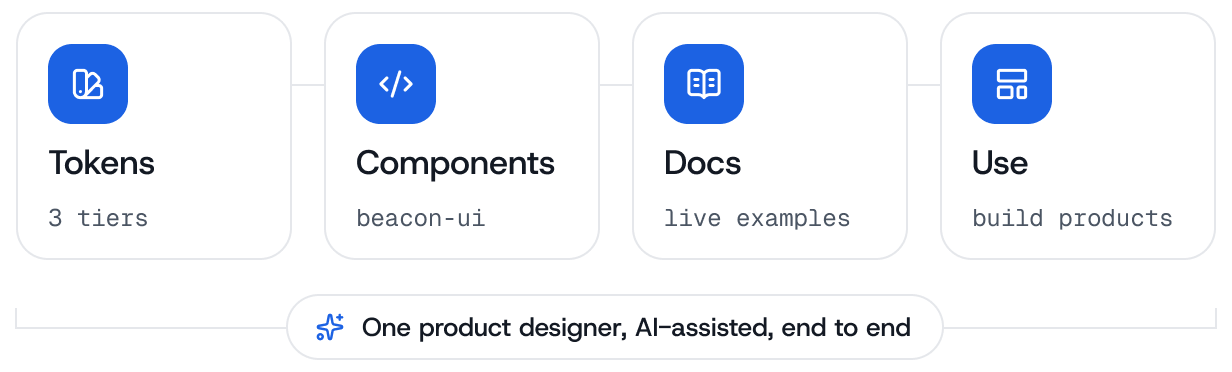
Beacon is a design system I designed in Figma and then built in code, with AI tools carrying the build loop between the two. Cursor, Claude Code and Figma MCP read the library directly, so the components, the tokens and the documentation were written against the design decisions rather than a handoff of them.
It ships on npm as beacon-ui and beacon-icons, and the site you’re reading is built with it, so it is already in production. This case study is about the AI-assisted process that got it there: how the editor was set up to understand the system, and how design decisions turned into working code.


The Process
Foundation
Tokens and components defined in Figma first, as the one source everything else reads from.
Automation
Variables export as JSON and build into CSS and TypeScript, with Figma MCP feeding the editor.
Packaging
Two versioned npm libraries, each updating on its own schedule.
Documentation
Live previews and a playground, written around how a component is used.
Consumption
Products install from npm, and this site is one of them.
Design Source
Foundation
The system starts in Figma, where the tokens and the components are built together rather than one after the other. Values that repeat across the UI (colour, typography, spacing, radii) are pulled out as tokens first, and every component is composed from those. Settling that in the design file is what stops the structure having to be reverse-engineered once the code starts.
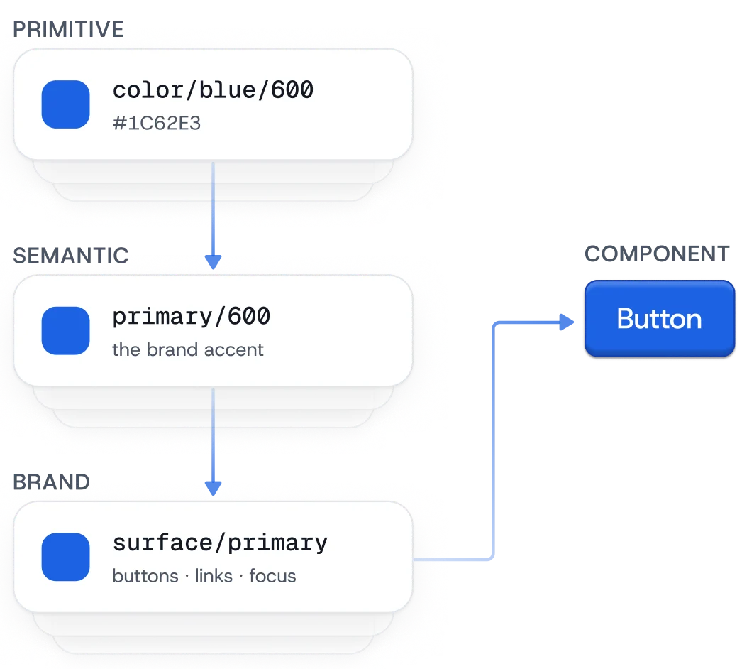
The tokens sit in a three-tier structure that keeps a raw value, its meaning, and its application apart. A Primitive holds the value. A Semantic names what the value is for. A Brand token assigns it to a role in the interface. The diagram traces one colour through all three: color/blue/600 carries the hex, primary/600 makes it the brand accent, and surface/primary is what a Button actually reads.
A fourth collection handles responsiveness. It carries breakpoints for desktop, tablet and mobile at 1440, 834 and 430, so spacing and layout step down with the screen instead of being re-specified for each device.
Because each tier can change without disturbing the one below it, theming and responsive behaviour are configuration rather than rework. The whole file is published on Figma Community under a Creative Commons 4.0 licence, free to open, copy and adapt.
Design to Code
Automation
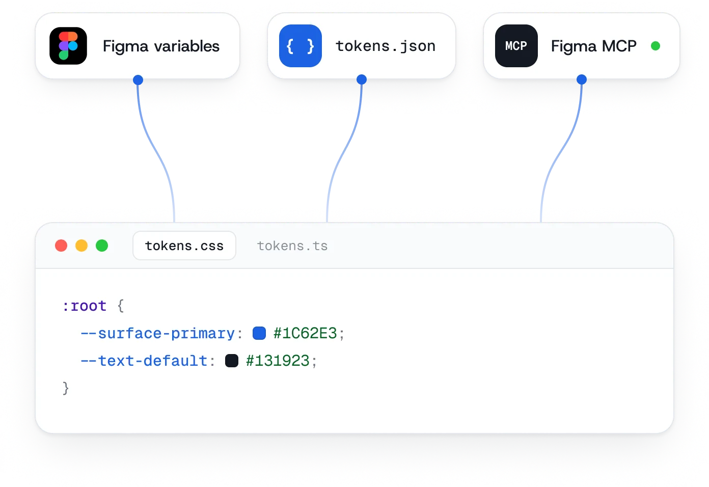
Tokens defined in Figma export as structured JSON, with the hierarchy and the aliases intact rather than flattened into isolated values. Build steps turn that JSON into CSS custom properties and TypeScript types, so a token is usable in code with type safety and without anyone copying a value across by hand.
Design context arrives by a second route. Figma MCP connects the file directly to Cursor, or any AI-native editor that speaks the protocol, so component structure and layout intent are readable in the editor while the code is being written. The diagram shows both routes landing in the same place: the generated stylesheet, and the design read live beside it.
Together they remove the step where a design is interpreted from a screenshot. The build is wired up in the project repository, and Figma’s own MCP documentation covers the local server setup.
Distribution
Packaging
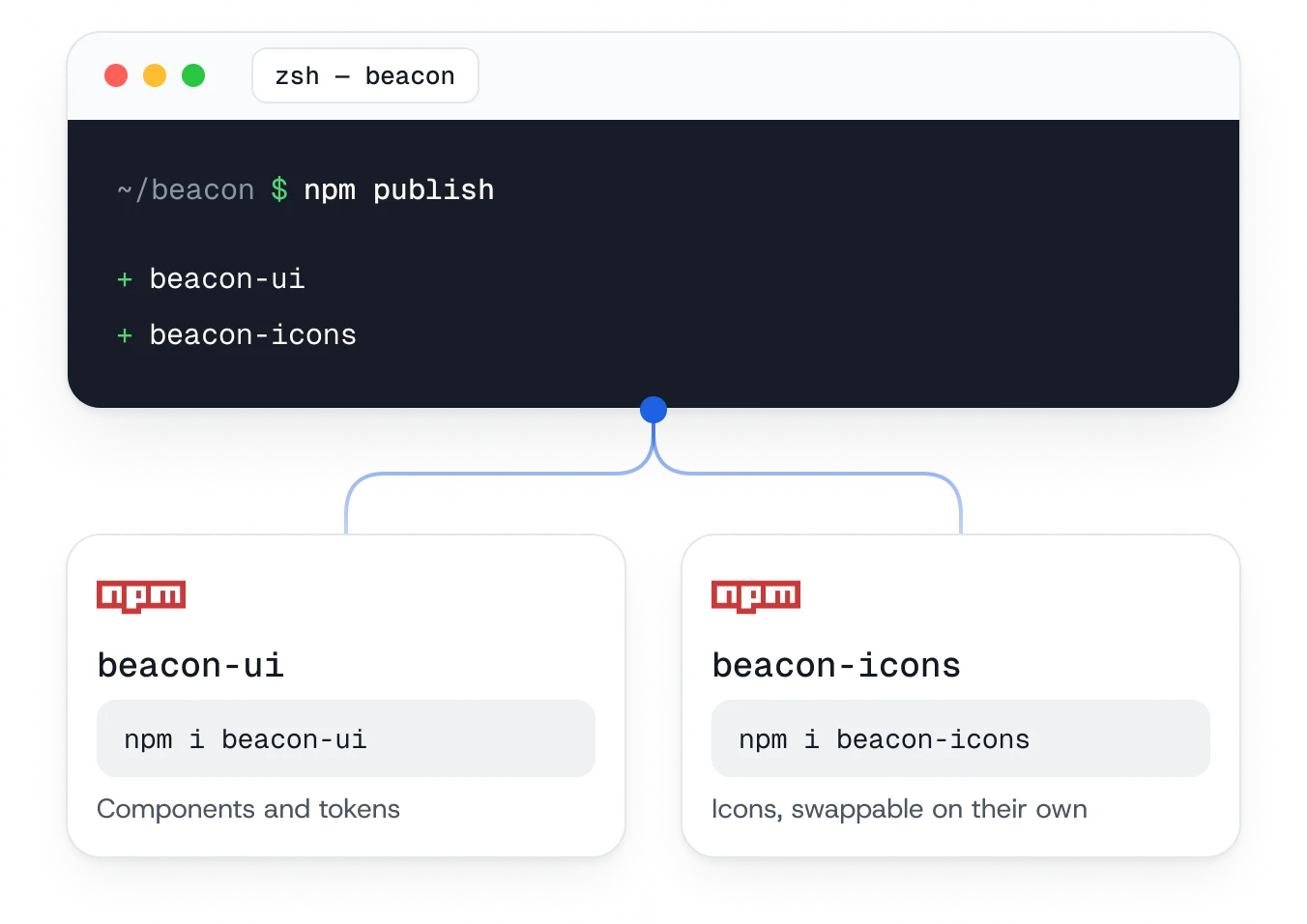
The system publishes as two versioned npm packages. beacon-ui carries the components and the tokens; beacon-icons carries the icon set on its own, so a project already committed to another icon library can take the components without it.
Splitting them also keeps the upgrade paths apart: adding an icon does not bump the package everything else depends on. The build handles bundling, exports and type generation, and semantic versioning is what makes an upgrade something a consumer can reason about rather than test for.
One command publishes both. That is the point at which the system stops being a repository and becomes something another codebase can install.
System Guide
Documentation
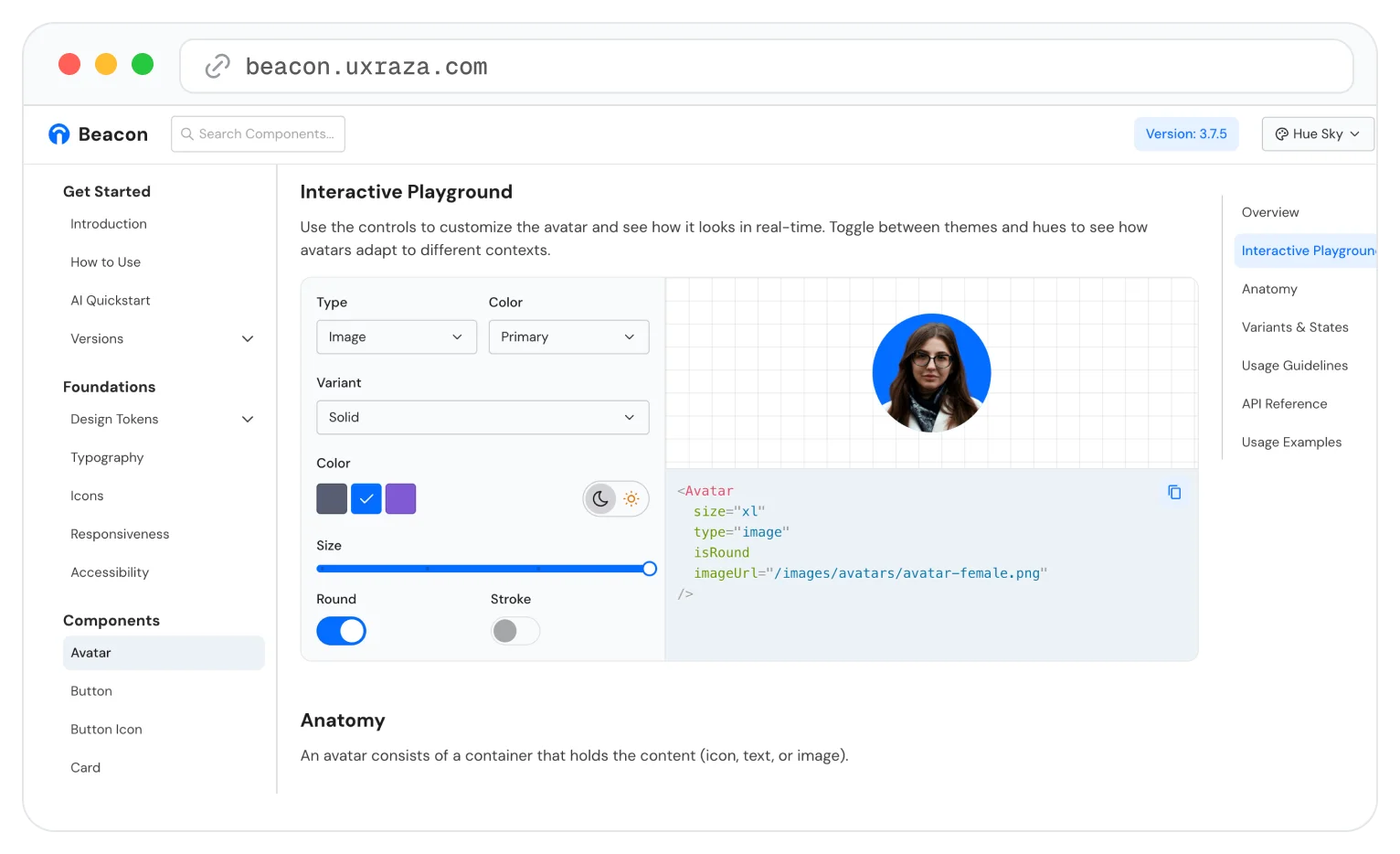
The documentation site is built alongside the system rather than after it. Every component has a page covering what it is for, the props it takes and how it is meant to be used, with the anatomy spelled out under each preview.
The playground is the part that does the most work. Changing a prop re-renders the component and rewrites the JSX beside it, so the snippet worth copying is the one already on screen. Themes and sizes switch in place, which is where a component’s edge cases tend to surface.
Because the pages generate from the same source as the components, the docs move when the system does instead of drifting behind it.
Product Build
Consumption
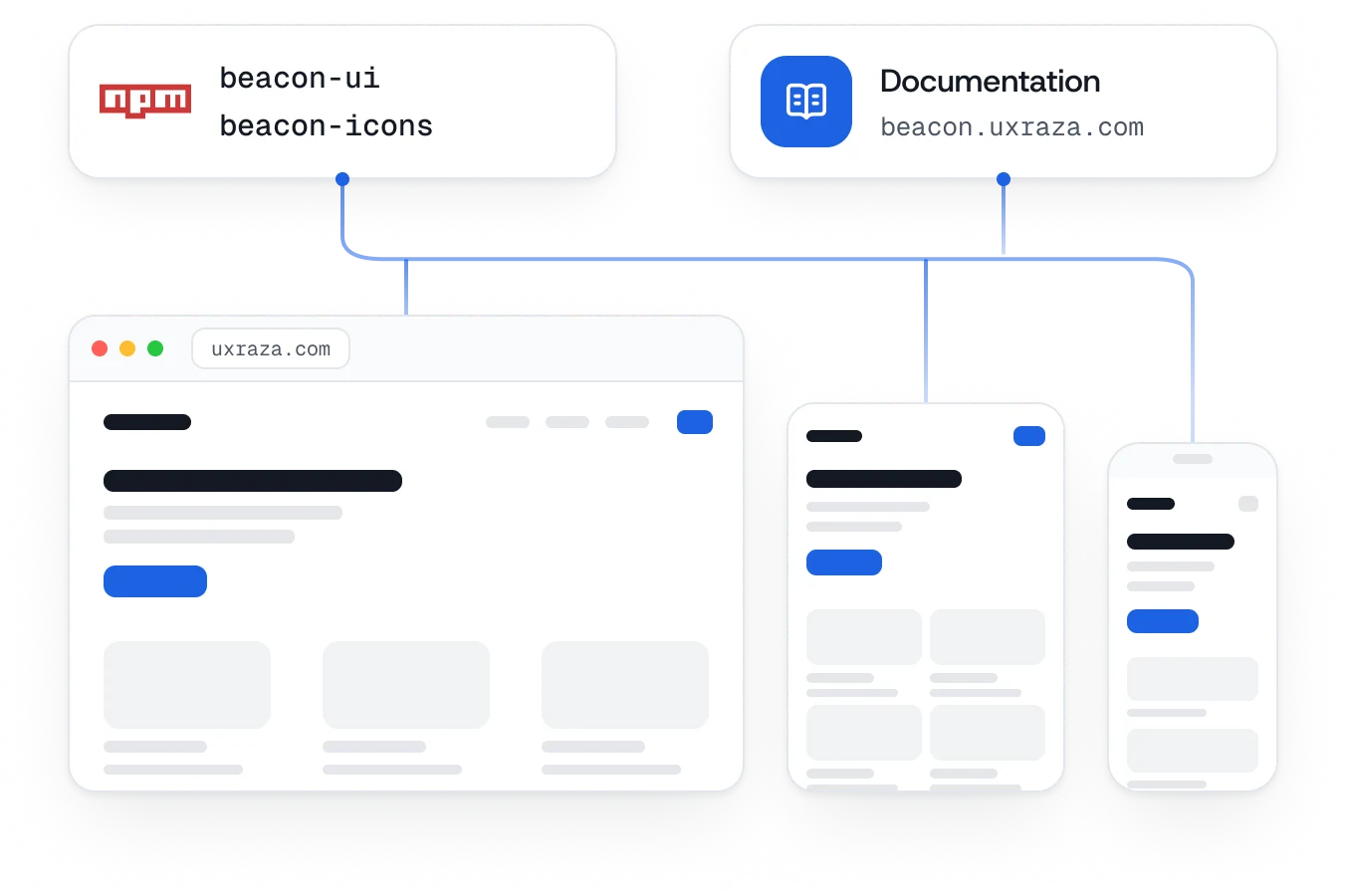
A project installs the two packages and works from the documentation. Components and tokens go straight into production code, and because the responsive collection travels with them, a layout built once holds at 1440, 834 and 430 without being re-specified per device.
This site is the case in point. It runs on the published packages, so every page here is the system rendering itself rather than a mockup of it.
Updates arrive as versioned releases, which is what lets a product take an improvement on its own schedule instead of on the system’s.
Setup
AI-Assisted Development
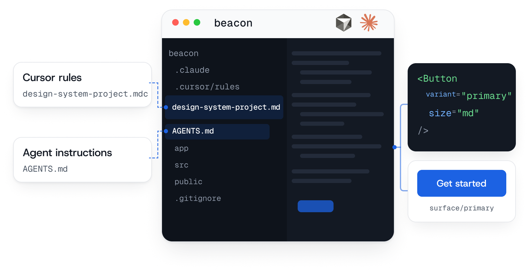
An AI editor is only as good as what it knows about the project. Two files carry that. AGENTS.md holds the workflows, the step-by-step guides and the quality bar an assistant writes against; .cursor/rules sets the coding standards and patterns that keep its output consistent.
With Figma MCP on top of those, the editor has the tokens, the file structure and the documentation before a prompt is written. A component described in Figma comes back using the system’s own names rather than approximations of them.
What changes is where the effort goes: less of it spent implementing the same patterns again, more on the decisions those patterns encode.
Outcome
What it adds up to
Beacon is in production and still growing: beacon-ui and beacon-icons on npm, a token architecture behind them, a documentation site with live examples and theming, and this portfolio running on all of it.
The thing worth taking from it is not the component count. It is that clear constraints and token discipline are what let a designer ship consistent UI at all, and that AI closes the distance between deciding something in Figma and having it working in code.
That distance is what used to make building a design system somebody else’s job. It is smaller now, and a designer with the right workflow can carry one the whole way: tokens, components and docs, published and in use.